Jim Steele turns to USCRN data to prove the US is not warming
Amidst the controversy and confusion over US temperatures even some climate crisis deniers seem to put some faith in U.S. Climate Reference Network (USCRN) data as a more reliable source of information than other temperature measurements, such as USHCN data.
The USCRN is a systematic and sustained network of climate monitoring stations with sites across the conterminous U.S., Alaska, and Hawaii. These stations use high-quality instruments to measure temperature, precipitation, wind speed, soil conditions, and more.
You can find out more about USCRN here.
So, Jim challenges data and a chart showing warming with data from the USCRN. Unfortunately for Jim, equivalent USCRN data shows warming as well.
Jim's Evidence
In this post on X (formerly Twitter) Jim Steels pushed forward the boundaries of his own dishonesty.
He writes that "dishonest climate alarmist propagandists try to suppress all scientific debate that exposes the bad science pushing a climate crisis".
He specifically challenges data and a chart provided by Maarten Keulemans as an example of a climate alarmist trying to use data affected by urban heat effects as evidence of warming.
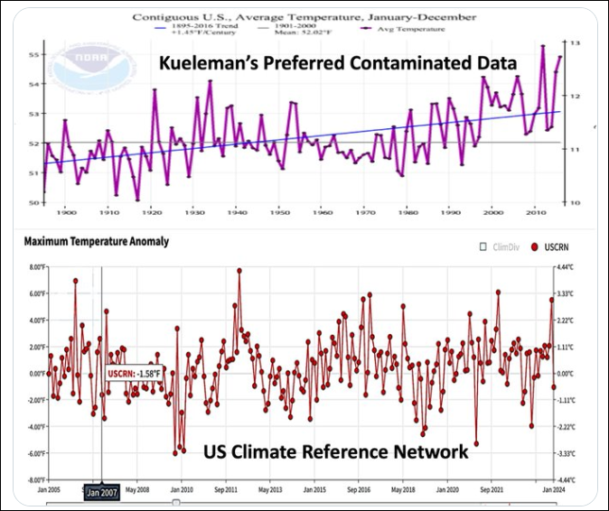
He confirms that he considers USCRN data to provide "the best USA statistic" - his words.
Jim's Comparison
He then shows this pair of charts, their mutual orientation apparently being chosen to suggest thst they are alternative versions of US temperature records over a period of time.
However, comparing these is an extrmeley dishonest move by Jim Steele.
Why?
Firstly, the upper chart covers the period 1895-2016. The lower chart covers the period 2005 - 2024. There is only a period of about 11 years where they overlap. Why would you not only show that part if you are promotiong a visual comparison.
Secondly, the upper chart shows annual values. The lower chart shows monthly values.
Thirdly, the upper chart shows average temperatures. The lower chart shows maximum temperatures.
Why would anybody compare these two sets of data and charts other than to be dishonest and deceive?
What the USCRN data really show
And right at the end of his post Jim Steele writes "The USCRN only shows temperature variability and no significant warming trend".
I've fitted a trend line to the USCRN data over that period. USCRN average temperature data show more warming (~0.3C per decade) than the NOAAA's "standard" global temp record does.
So, "the best USA Statistic" shows warming as well.