Why can't Chris Martz understand warming?
I'm fairly sure that Chris Martz isn't really being obtuse about warming.
I'm increasingly convinced that it's not that he deliberately denies it - or at least its significance - for some reason.
It seems much more likely that he just needs it explained in terms he can understand.
I'm going to try to explain it to him here.
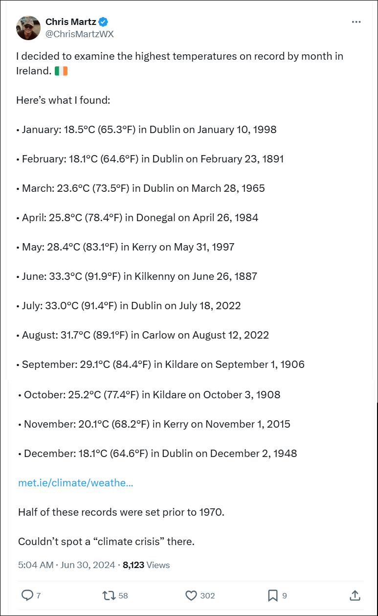
In this post on X.com (click to see the original) Chris Martz lists record temperatures for each of the months of the year in Ireland.
You can see that the years of each record vary, and some of the records are very old.
The conclusion that Chris comes to is that he 'Couldn't spot a "climate crisis" there'.
The reason he couldn't is that he doesn't seem to understand that Nature doesn't work in the way he would like it to.
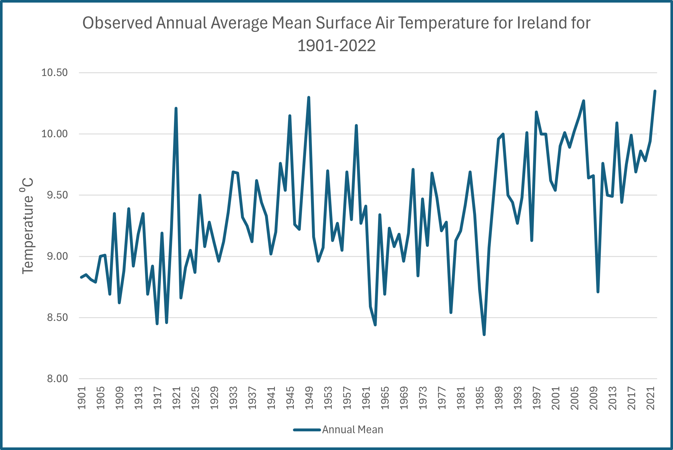
Irish national temperature since 1901
The chart shown here is based on one from the Climate Change Knowledge Portal and is based on data from the Climate Research Unit (CRU) at the University of East Anglia.
Now, the first thing to notice is the jaggedy line, which connects the points. Each point is the average temperature in the Republic of Ireland for that year.
The line is not very smooth is it, Chris?
Nature doesn't really do straight lines when it comes to measured vaues over time.
But here's a question for you.
Is Ireland getting warmer?
Some people might look at that chart and - for example - say "well it was particularly warm in 1921 but much cooler in 1986. It's definitely getting cooler!"
Another person might say "Yes, but look how cool it was in 1963 and how warm it was in 2007. It's definitely getting warmer."
Which of them is right?
Is Ireland getting warmer?
A scientist doesn't look at specific values like this to deduce whether it's getting warmer or colder. A scientist looks for the trend in the numbers.
A basic but very effective way of seeing what's going on is to create a "best fit" straight line to the data, which will be the straight line that is closest to (best fits) the data points.
I've added the best fit trend line here (it's done using something called the method of least squares).
And what does the trend line show? It shows warming. How much? Almost 1oC over 120 years, which is pretty typical.
So, don't be confused by those high and low values - often called outliers - as they're just Nature's way of trying to confuse you.
Ireland is warming.